
In today’s beauty industry, it’s not only about what a brand creates — it’s also about how it’s perceived. Every element — the name, fonts, colors, and packaging — forms a cohesive image in the minds of customers.
So when we chose to transition from Nikk Mole to Moléa, it wasn’t just about words. We were creating a new visual and emotional identity that would better express our values.
Softness and Elegance in Every Detail
The name “Moléa” was born from a desire to reflect the qualities we infuse into our products — softness, femininity, elegance, and professionalism. It’s easy to pronounce in different languages, memorable, and evokes positive emotions.
With the new name comes a new logo. The updated design blends:
- modernity and flowing lines
- soft, rounded forms that highlight femininity
- clarity and simplicity to emphasize professionalism
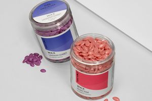
We consciously moved away from the sharp lines and harsh tones of the previous brand style.
Aligned with Global Trends
The global beauty market is increasingly embracing soft beauty — in formulas, textures, names, and visuals. That’s why it was crucial for the new Moléa identity to resonate across different regions — Europe, Asia, the Americas.
We followed key global trends:
- effortless perception
- minimalism
- elegant shapes
- gentle communication
- emotional connection with the customer
This is how we shape the new identity of Moléa — a brand that speaks a clear, universal language to audiences worldwide.
From Word to Lifestyle
Changing our name and visual style is more than a label redesign. It marks a new phase in our brand’s evolution — one that aligns with international trends while staying true to our essence, sincerity, and love of beauty.
Thank you for being part of this journey. Even more beauty awaits — with Moléa.